Graphic Elements
Our Gies Business designers are experts at communicating the brand visually and are trained on how to best use our visual elements.
These elements visually distinguish Gies College of Business from other schools and complement the university.
Graphic Textures
Finial
Inspired by the many finials found atop campus buildings, this modern interpretation gives a nod to our history and traditions.
The finial pattern can be used to create a grid for designs.

Ascending Lines
Ascending lines reference the forward momentum of the university.
They can be used as a connecting element or background texture. The lines should always be at 45-degree angle and move up to the right.


Block I Frame
The framing element mimics the curve of the Block I.
Create this element by rounding one corner of a photo frame to match the inside curve of our Block I or by layering a box with a rounded corner on top of the photo.
.png?sfvrsn=76752c21_0)
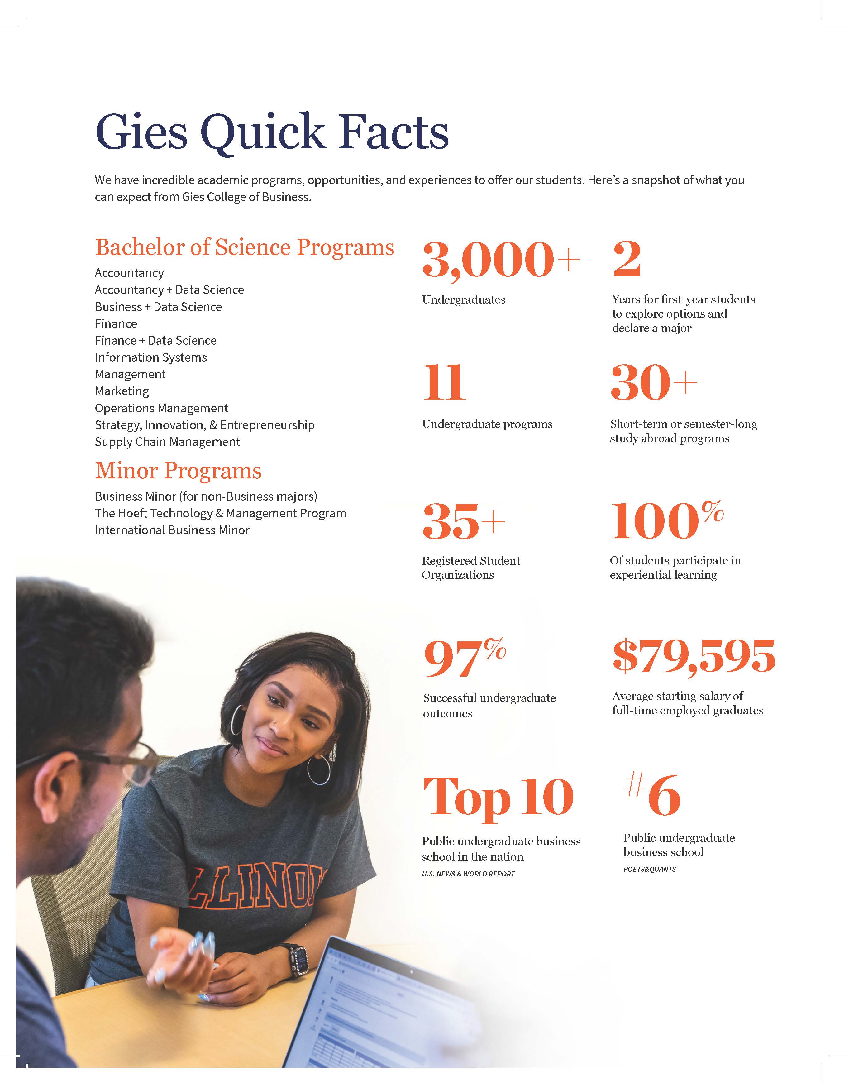
Stats
The number of stats per page, as well as the ratio of descriptive text to size of the number, are important considerations for this graphic element. For grid arrangements, stats tend to look best in multiples of 2 or 3. Try to keep descriptive text to fewer than 5 words when possible. Descriptive text may not surpass three lines of text in final layout.
Stacked Gies: Optional Graphic Element
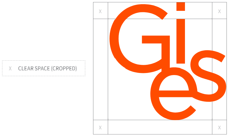
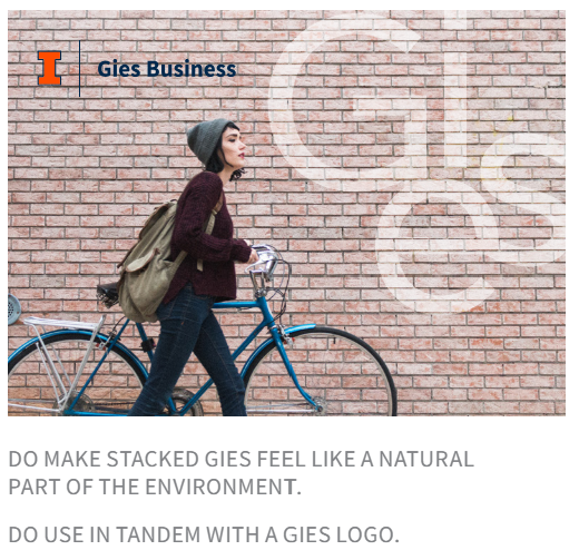
The Stacked Gies is an optional graphic element inspired by the collaboration, cross-pollination, and culture of shared purpose that abounds in our College. This element should be implemented by MarCom only and should always be used together with our wordmark. It should be used sparingly and at the discretion of MarCom.
The clear space around the Stacked Gies fits within the counter and the circular bottom portion of the capital G. Always maintain sufficient clear space to maintain legibility, and never allow competing elements to invade this space.
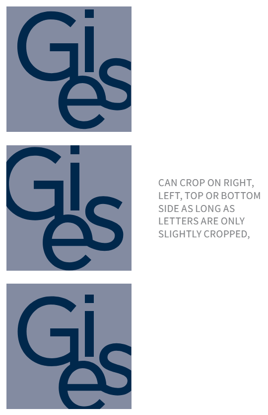
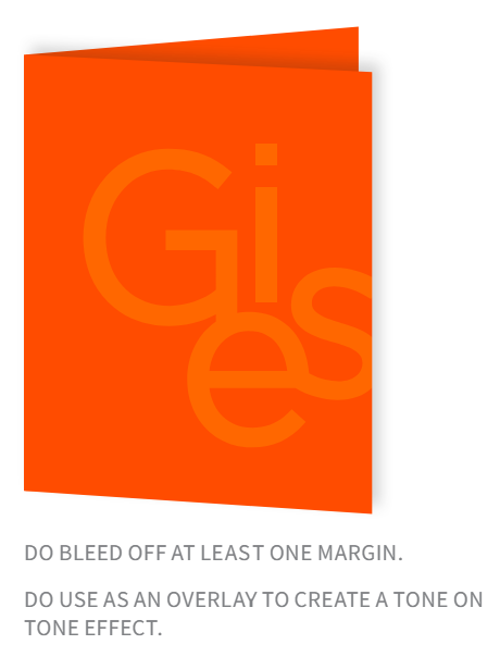
This element should bleed off at least one margin in printed and digital materials.
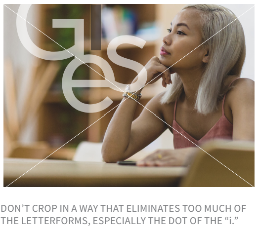
When cropping, be sure the dot of the “i” remains intact. When used as an overlay or background element, it should be at 60 percent opacity or lower. This will allow the element to pick up its background color, creating a tone-on-tone effect.
Stacked Gies Guidelines

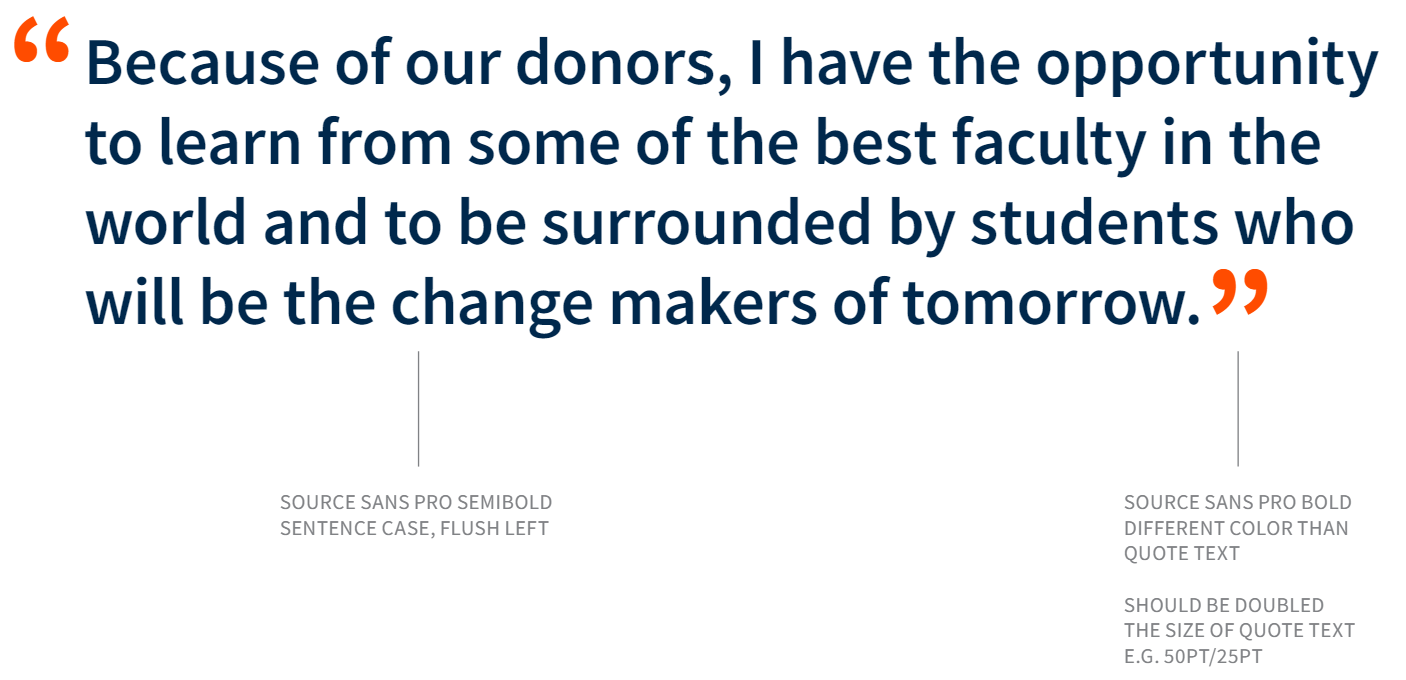
Pull Quotes
